
A Pareto chart is widely used in all types of industries to analyze a problem and prioritize work. Scroll down to know more about this chart.
Generally, people working on a project are asked to prioritize the tasks at hand. With the help of this analysis, they are able to differentiate between the ‘trivial many’ tasks and the ‘vital few’ tasks. By this, they realize which tasks which need to be given attention first. At the same time, it helps in time management as well as resource management. Resources, both in terms of money and man power, are saved, when sufficient attention is paid to the vital few tasks. Therefore, it is often used in total quality management. A mathematical expression, called the 80/20 rule is used for the same. It is said that 20% causes result in 80% problems. However, there has to be a tool that will help us identify the 20% causes. This is where the Pareto chart comes into picture.In this BusinessZeal article, we will read about it in detail.
What is a Pareto Chart?
The other name given to this chart is Pareto diagram or Pareto analysis. There are two types of variations used in this chart. They are known as weighted chart and the comparative chart. It was Vilfredo Pareto, who is said to have invented this chart. He was an Italian economist. This chart contains a bar graph as well as line graph. The individual values are placed in the descending order by bars, while the line graph is used to display the cumulative total. The purpose of this chart is to graphically summarize the data and display it in terms of relative importance between the different groups of data. It helps in highlighting the largest set of factors. If it is used in terms of quality control, it is able to show the common source of defects, or the highest occurring defect, most repeated reason for customer complaints about a product, etc. In other words a great tool for customer relationship management.
To prepare a chart, the data is segmented into different groups. These groups are also known as segments, bins or categories. The vertical axis on the left marks the frequency of occurrence. However, the left vertical axis can also be used to display a unit of measure as well. On the other hand, the vertical axis on the right is used to depict cumulative percentage of the total number of occurrences. Often, the total of a particular unit of measure is plotted on this line. The reasons are placed on the horizontal axis, and they are placed in the decreasing order. Hence, the cumulative function shows a concave function.
Pareto Chart Example
One can make this chart in Microsoft Excel as well as in OpenOffice. In other words, software which have spreadsheet programs (like Microsoft office) can be used for the same. We will try to understand the chart with the help of an example.
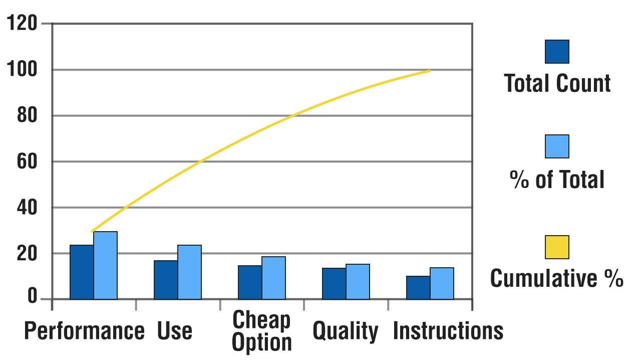
| Product Returned Reasons | |||
| Problem | Total Count | % of Total | Cumulative % |
| Performance not up to the mark | 24 | 30 | 30 |
| Not easy to use | 18 | 22 | 52 |
| Cheaper option available | 15 | 19 | 71 |
| Quality not as expected | 13 | 16 | 87 |
| Complicated instructions difficult to understand | 10 | 13 | 100 |
| Total | 80 | 100 | 100 |
The above example shows the different reasons under which a particular product has been returned to the company. The total count, depicts the total number of times the product has been returned under a particular reason. It will help the company in assessing the reasons under which the particular product has been returned. The analysis will help in improving the product and reduce the chances of product returns.